Optimize Your CTA: Better Alternatives to ‘Learn More’

What are your thoughts on “learn more” links?
Have you considered the potential impact on your website? Is it killing your conversion rate and increasing your bounce rate?
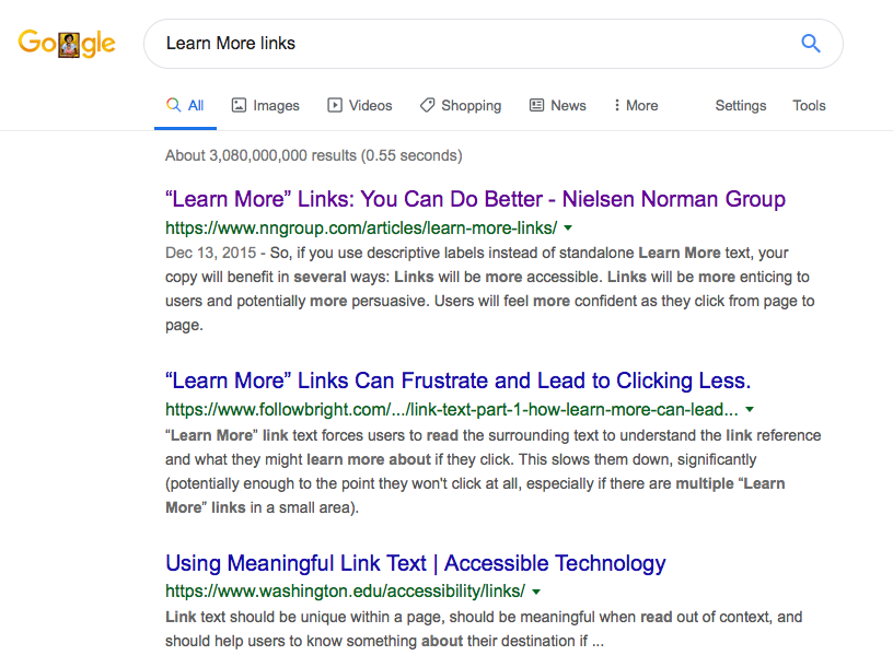
A Google search for “Learn More links” generates approximately 3,080,000,000 results. In other words, people have a lot to say on this subject.

The Purpose of Learn More Links
The learn more link exists primarily because of the proliferation of the practice on blogs of deferring secondary content from the primary feed. It also helps defer content for mobile-optimized sites, structuring content in small, digestible chunks.
Learn More or Read More allows you to show a summary of your article on your homepage or blog page with a read more link, MoreTag, or excerpt text. Instead of making all the details available by default, headings and short paragraphs provide an easy-to-scan, digestible overview of essential content.
After tapping the link, the user can expand the content or visit the page with the complete article. WordPress comes with two built-in methods for this. One of these methods is known as the More Tag.
This design capability is necessary. We are discussing the link content only, not the general idea of summarizing content and deferring visitors to additional pages.
Why Learn More Is a Problem
Learn More, Read More, and Click Here links are commonly placed after a short paragraph (or just the title) introducing the content, service, or feature.
While it appears harmless, there are several issues with this:
1. Weak call to action
“Learn more” is not a solid call to action. It may be commonly used, but it doesn’t entice readers to click. Instead, it gives them a reason to leave your site searching for a more user-friendly experience.
2. Uncertainty
Does the learn more link always lead the reader to the same page? Does it lead them to a page they don’t want to see? Users don’t want to waste time searching your website for information.
Clear navigation, which doesn’t typically include learn more links, will direct visitors in the right direction and bring them back to your site in the future.
3. It does nothing to help with search engine optimization
Hundreds of learn more links can harm your rankings, as opposed to pushing your site to the top of the search results.
When you replace “learn more” with targeted keywords, your site will be better optimized for search engines.
The biggest mistake you can make is using “Learn More” as a standalone link.
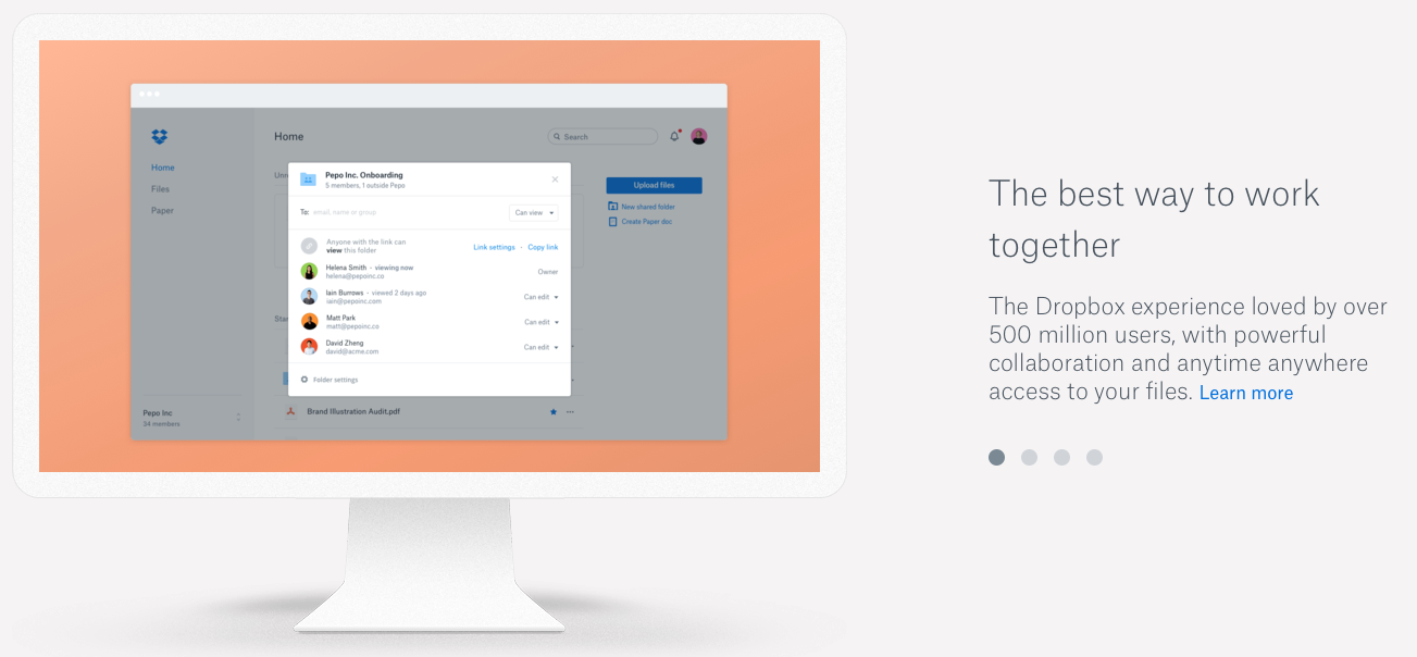
For example, let’s take a look at the Dropbox homepage:

Is there a better phrase Dropbox can use to entice readers to click? Probably.
However, by combining the link with a short snippet of information, readers at least have a better idea of where they’re going.
Imagine what this would look like if the four lines of text were deleted. With nothing more than a title and learn more links, the click-through rate would suffer.
But we can’t write an incredibly long and unique description in the anchor text of every link. So, what should we do?
Learn More Link Alternatives
At this point, you should better understand how learning more links can affect your website’s performance. However, there’s still an important question to answer:
What are the best learn more link alternatives?
Another way to say “learn more” and make a link accessible is to make the anchor text relevant and descriptive. While this depends mainly on the layout of your site, your audience, and what you’re trying to accomplish, there are a few strategies to consider:
1. Use Keywords to Describe the Link’s Destination
This is the most common approach, as it provides the reader with clarity while also helping from an SEO perspective.
For example, a digital marketing agency may display a list of services on its homepage. These can include SEO, content marketing, social media marketing, and link building.
Rather than use “Learn More” or “Learn More About XYZ,” consider the following:
- Learn How SEO Will Boost Your Revenue
- The Power of Content Marketing
- Take Your Social Media Strategy to the Next Level
Not only does this make your links more enticing to the reader, but they also hold SEO value.
Here’s an example from Dasheroo’s website:

Rather than simply using “learn more,” “Browse our integrations and insight library” is inserted after the title. This gives the reader a clear idea of where they’re headed if they click the link.
2. Add Descriptive Text as the Hyperlink
This is similar to the approach above, with a slight twist. Rather than eliminating the phrase “learn more,” you follow it with descriptive text.
ADA Website compliance benefits to descriptive text
Blind people, those with low vision, and people with other disabilities that affect their ability to read a computer display often use different technologies to access the information on a webpage.
Two commonly used technologies are screen readers and refreshable Braille displays. As discussed, a screen reader is a computer program that speaks the text on the computer display, beginning in the top-left corner.
Screenreader users often use hotkeys to navigate the page, skipping to the next heading or link. If they skip to a link that says “read more” or “learn more,” it’s not very helpful or descriptive if the screen reader lacks information on what else will actually be learned when the link is clicked.
Sticking with the example above:
- Learn more: How to SEO Your Website in 2019
- Learn more: Top Social Media Tools for Small Businesses
- Learn more: Content Marketing Made Easy
So, the best way to make a link accessible is to make the anchor text relevant and descriptive. With this approach, hyperlink the descriptive text rather than “learn more.”
Once again, this gives readers more reason to click while also positively impacting your SEO and ADA compliance for those using screen readers. For further information on optimizing for screen readers, check out this article on using CSS to hide a portion of the link text.
3. Share a Paragraph
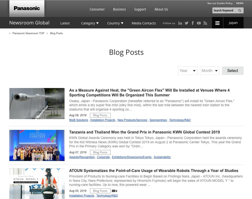
The best way to explain this is to share an example. The Panasonic blog looks like this:

- There is no learn more link
- There is no descriptive text
- There is a paragraph that explains what the blog post is about
- The entire paragraph and title are clickable
While a few words can say a lot (see above), an entire paragraph is even more descriptive. This gives the reader everything they need to decide whether to read the blog post or search for something else.
Final Thoughts
Upon review, you may find that your website and/or blog heavily rely on learn more links.
With the tips above, you know how to make the necessary changes. Here are some tips for getting started:
- Review your website and blog in great detail
- Decide if one or more of the solutions above will yield positive results
- Spy on your competition to see the approach they’re taking
- Make changes
- Track the results and continue to tweak
What are your thoughts on learn more links? Have you experimented with one of these solutions? Did you take a different approach? Share your advice in the comment section below.
 August 13, 2019


